Living Elements | Luxury Appliance Leaflet Design by Living Elements is a premium brand specializing in kitchen and bathroom appliances designed for modern, upscale living. Their products cater to homeowners with a taste for refined aesthetics and functional elegance. For this project, was tasked with creating a printed marketing piece that would reflect the brand’s identity while clearly communicating product benefits in a simple, accessible format.
Brand Overview
Living Elements targets middle- to high-income households seeking quality appliances that complement their interior design. The brand’s visual language is rooted in minimalism, with a focus on clean lines, neutral tones, and understated sophistication. The goal of the project was to create a marketing tool that would align with this identity and serve as an informative resource for potential customers.
Project Scope
The deliverable was an 8-page A5 leaflet, designed to be used in showrooms, trade events, and direct mail campaigns. The content needed to be easy to read, visually appealing, and structured to guide the reader through the brand’s value proposition and product highlights.
Deliverables included:
- Layout design for an 8-page folded leaflet
- Typography and image selection
- Print-ready artwork for production
Design Approach
- Clean Layout: The design emphasizes white space and structured grids to create a calm, elegant reading experience.
- Typography: A modern serif was paired with a clean sans-serif to balance sophistication with readability.
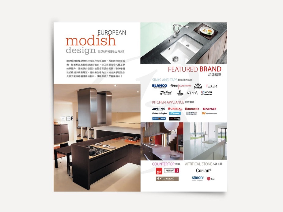
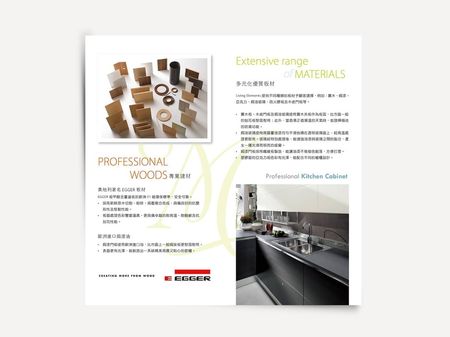
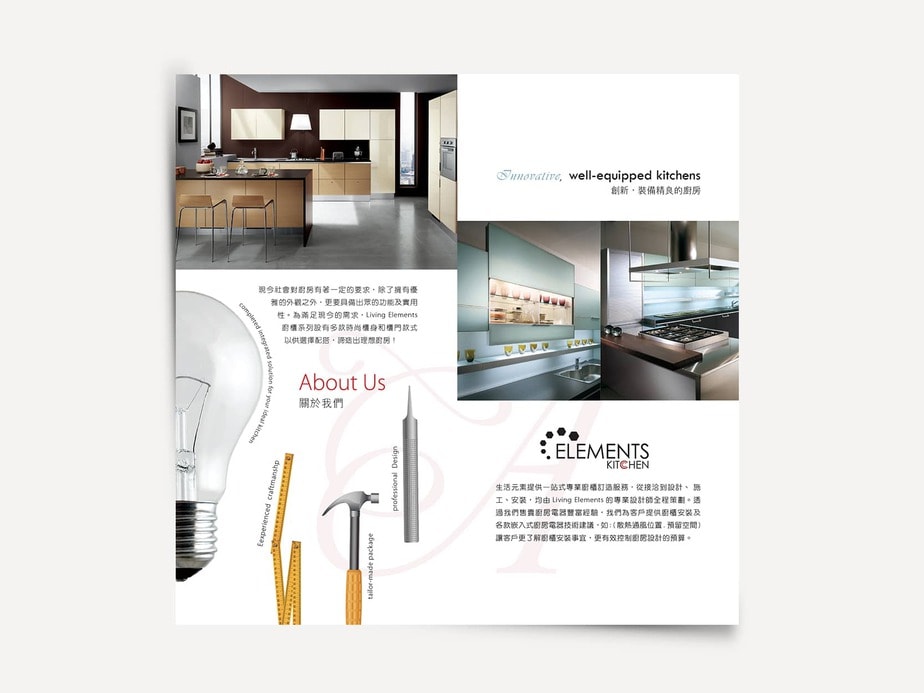
- Imagery: Product photos were placed against neutral backgrounds to highlight form, material, and detail.
- Content Flow: The leaflet was organized into clear sections—brand introduction, product features, lifestyle benefits, and contact information.
Print Considerations
- Format: A5 landscape, saddle-stitched, 8 pages
- Paper: Matte-coated stock for a soft, tactile finish
- Color: CMYK with spot varnish on product images for subtle emphasis
- Margins & Bleeds: Designed with print-safe zones and bleed areas for professional output
User Experience
The leaflet was created with showroom visitors and design-conscious homeowners in mind. The tone is informative and calm, avoiding technical jargon in favor of clear, benefit-led messaging. The layout guides the reader naturally from brand values to product highlights, ending with a clear call to explore further.
Related Projects
- – A structured, colorful print piece for a PLM technology company
- – Visual identity for a multi-generational gift shop
Table of Contents