Sports Game Graphic Design Hong Kong: Sportcraft USA by Sports game graphic design in Hong Kong requires precision, brand alignment, and visual clarity—especially when creating assets for retail distribution. For Sportcraft USA, a company specializing in indoor and outdoor sports games sold at KMART and SEARS, developed a series of graphics that align with the brand’s corporate guidelines and retail standards.
Company Overview
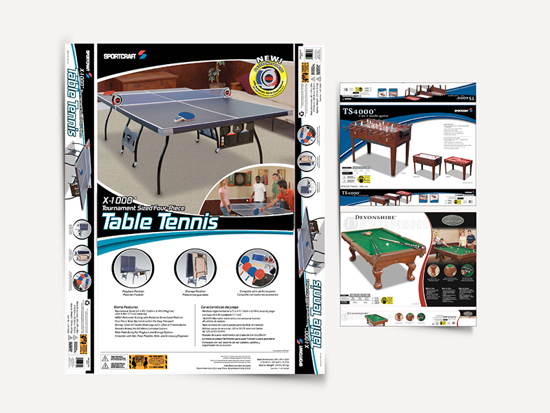
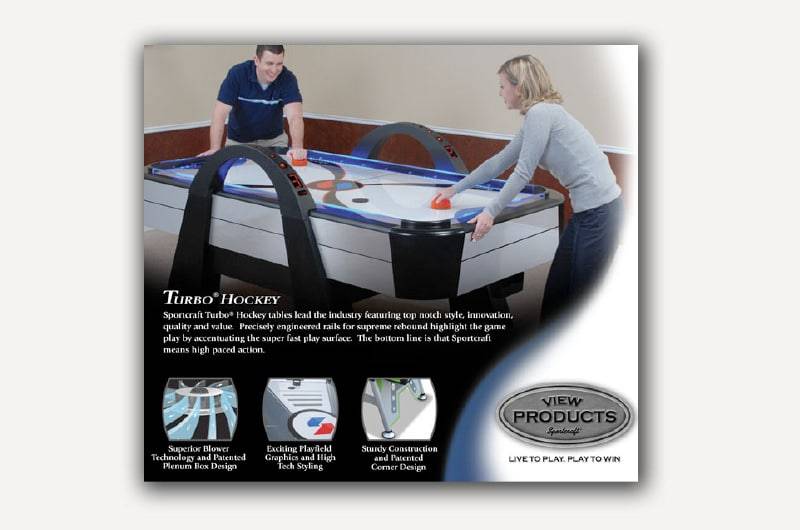
Sportcraft USA is known for producing a wide range of recreational sports products, including table tennis, basketball hoops, lawn games, and more. Their products are distributed across major retail chains in the United States, with a strong emphasis on family-friendly entertainment and durable design.
The visual assets needed to reflect the brand’s energetic tone while remaining consistent across packaging, instruction manuals, and promotional materials.
Project Scope
The design work focused on creating game graphics for multiple product lines, including:
- Indoor tabletop games
- Outdoor lawn and backyard games
- Portable sports kits for family use
Each graphic was developed to fit specific packaging formats and retail display requirements. The designs were created in alignment with Sportcraft’s corporate branding, including logo placement, color usage, and typography standards.
Design Approach
- Brand Consistency: All graphics followed Sportcraft’s official style guide, ensuring consistency across product categories.
- Retail-Ready Layouts: Designs were optimized for visibility on shelves, with clear labeling and engaging visuals.
- Color Strategy: A bold, sporty palette was used to reflect energy and movement, while maintaining legibility across print formats.
- Illustration & Iconography: Custom icons and illustrations were created to explain game rules and setup steps visually.
Technical Highlights
- Delivered in high-resolution formats suitable for print and digital use
- Color profiles adjusted for CMYK printing standards
- Layered files provided for packaging teams to adapt across SKUs
- Typography and layout tested for multilingual compatibility
Execution Notes
The project involved working with pre-defined dielines and packaging templates provided by the client. Each graphic was tested for scale, clarity, and alignment with retail display requirements. The final assets were delivered in both editable and print-ready formats for use across marketing and production teams.
Related Projects
Table of Contents